Goal
A UX overhaul of a Password Management app.
Overview
Pass Wizard is a password management application with both free and paid versions available. There were a few design flaws that needed to be addressed, particularly on mobile, and there was also some recent evidence to suggest that the sign up process needed to be simplified.
Streamlining Sign Up
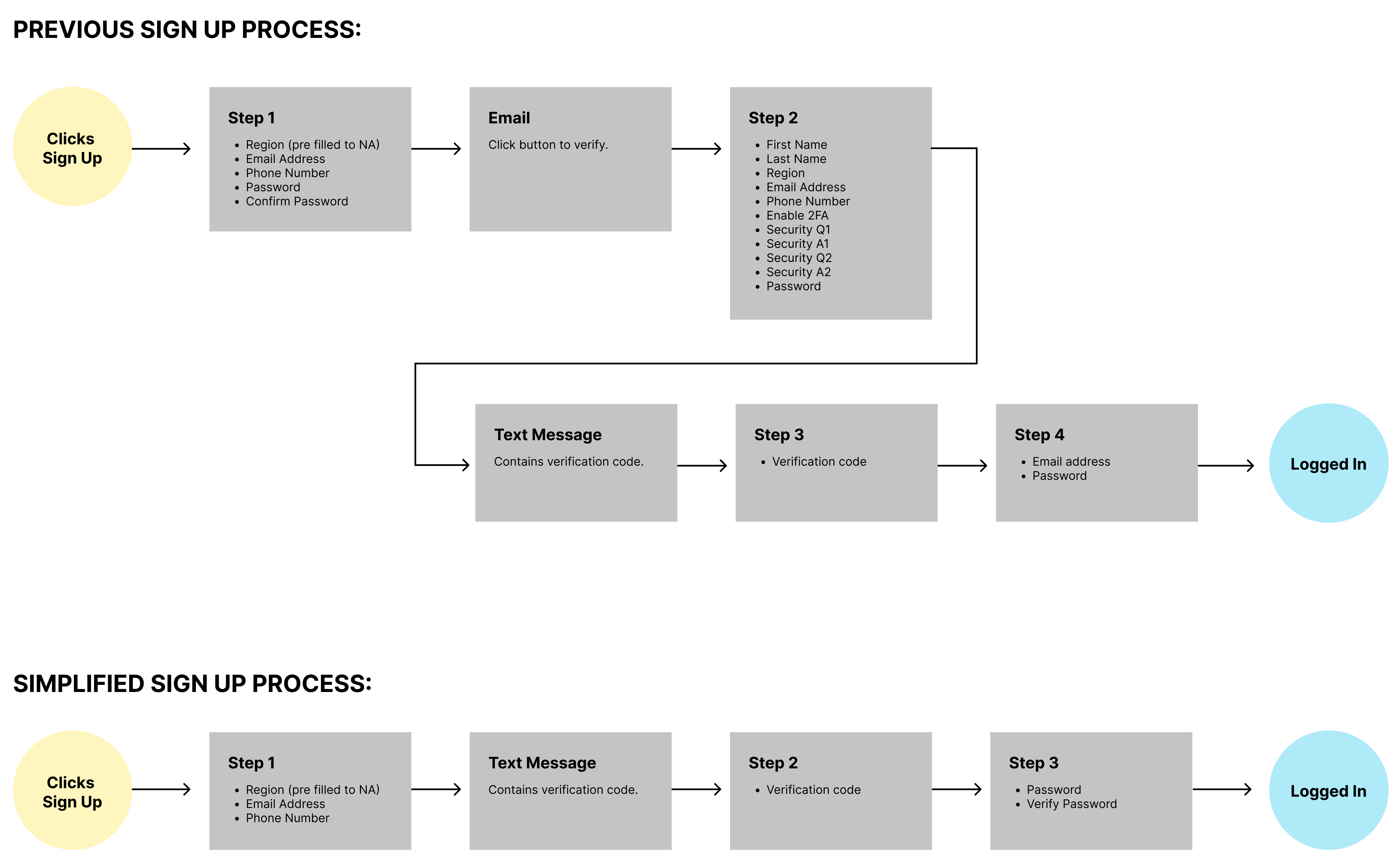
There was data coming from recent Google Ads the suggested the sign up process was too robust and might be putting off potential clients. With a bit of investigation it did seem as though there was plenty of room to trim the process down and hopefully encourage more sign ups. I created this user flow to illustrate the simplified process for our devs. As you can see, there were many unnecessary hoops to jump through, and sure enough we saw an improved rate of sign ups after deploying the changes.
Improved UX
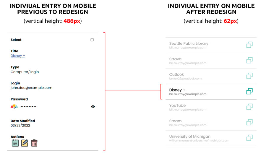
After auditing the app, I came up with a number of different ways the overall user experience could be improved. First, the method of listing the various passwords and credentials took up far too much vertical space, causing excessive scrolling and an inability to quickly scan for the correct item. I consolidated only the critical info into the list view and relegated less important information to a detailed view for each entry, all while actually making it easier for users to copy their password.
I also found a way to streamline another important process - adding a new entry. Previously the app had New Password Entry nested with Import Passwords, causing an unnecessary click in a critical process. I instead paired Import and Export passwords on a separate page, which allowed us to streamline the process of adding a password, while also removing the export button from atop the password listing.
Another process that needed help on mobile was the bulk delete functionality. The previous design worked fine on a desktop, but was not suitable on smaller screens, so came up with a new concept on how that function could work across all devices.
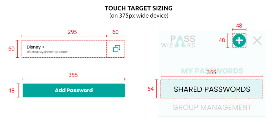
Lastly, I reworked the navigation to be more mobile friendly with larger buttons and the new and improved information hierarchy. I delivered my designs to our dev team by way of a robust Figma prototype which allowed them to visualize all of the proposed changes.
 Lots of thought went into simplifying the user experience on mobile.