Discovery Session
Designing a logo is more than just creating a pretty symbol — it’s about crafting a visual identity that captures the essence of a brand. The first step is always getting to know the client. For every brand design client, I conduct a discovery session to understand their business, values, target audience, and goals.
Based on the insights gathered in that discovery session, I create multiple logo concepts. This stage is about exploring different directions and visual ideas that align with the brand’s identity.
Initial Concepts
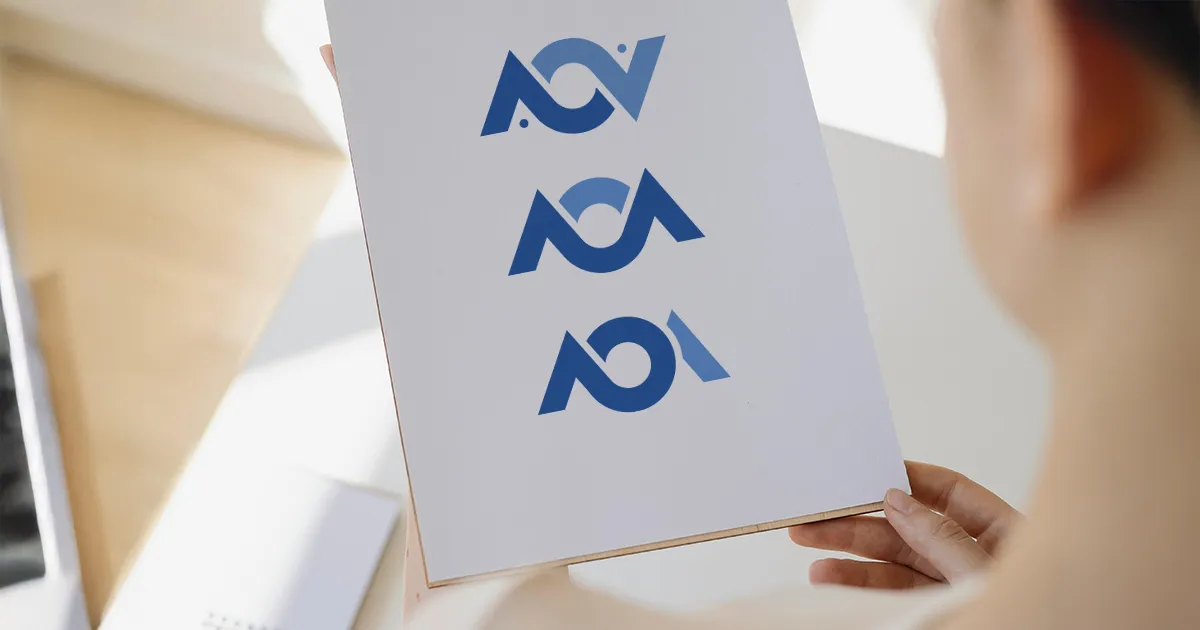
For AOA Bookkeeping we decided that blue was the preferred color choice due to its association with trust and dependability, but may be open to greens or teals. I also discovered that the client preferred a more minimalist design for the logo, but also was potentially interested in something with a bit of elegance.
I created the initial logo concepts based on these parameters and then delivered them to the client for review.

Revisions
The client then reviewed the concepts and provided feedback. In this case, the client really enjoyed the abstraction of the double helix concept, but was concerned that the monogram may be read as “AOV” instead of “AOA”. She asked that I alter the logo to more clearly signify “AOA” while keeping it abstract.
The Finished Product
I provied several revised options to the client based on that feedback. Ultimately, we were able to achieve the perfect logo for this partiular client’s needs, and they were thrilled with the new branding. Once the final design was approved, I prepared it into all of the necessary file types to be used appropriately across digital and print media alike.
