Goal
A complete redesign of an existing file transfer system.
Overview
MegaMail was in desperate need of help. The website had gone almost a decade without a redesign, and it showed. The service needed to be rebranded, the web application was non-responsive, the contact page was literally just a phone number (which I don't even think was still in service), the features page was unreadable and inaccurate. Ressurecting it would be quite a project. So, myself and a fellow software engineer rolled up our sleeves and went to work.
Brand Design
Initially I came up with several distinctly different concepts to begin defining which direction to take the branding. Once one concept was decided on, I put together a brand guide and wrapped a bow on this stage of the project.
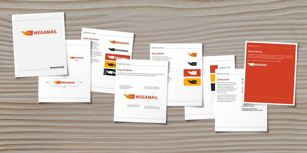 The Megamail brand guide.
Prototype and Admin design
When it came to designing the actual app, I mocked up nearly all of the pages to get a feel for the look and how it would carry over to all of the various aspects. Then I tested certain features and functionality by creating a prototype using those mockups.
User Levels
In MegaMail there are three levels of users. You have the standard user, who has access only to their own account settings and contacts. Then you have admin users who have all of the access of standard users plus the ability to add and edit members of their 'group'. Finally you have the super user, a level of access only allowed for developers or other behind the scenes administrators of the application.
All of these different angles needed to be thought out, and various user flows were tested, poked, and prodded until eventually everything was airtight.
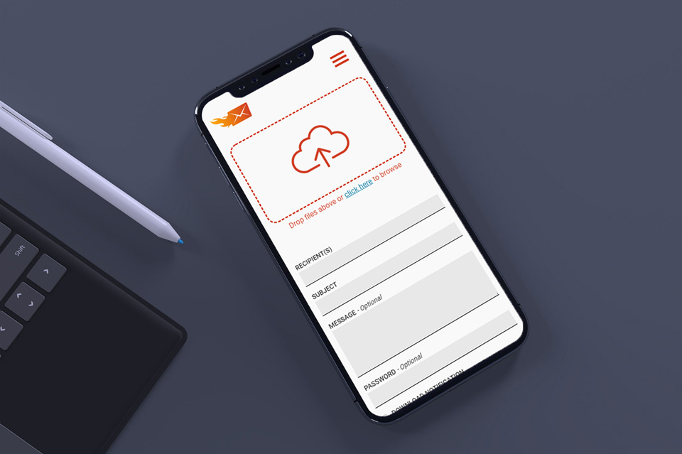 I used a simple layout to make sure it would translate well to mobile devices.
Mobile First
Although MegaMail is a web application, I treated the design process it as if it was a mobile app to make sure all of the features would carry over seamlessly to your phone.
Layouts were kept simple. Forms were kept stacked in a single column. Inputs were kept large enough to be easily selected with the stubbiest of fingers.
Portal Site
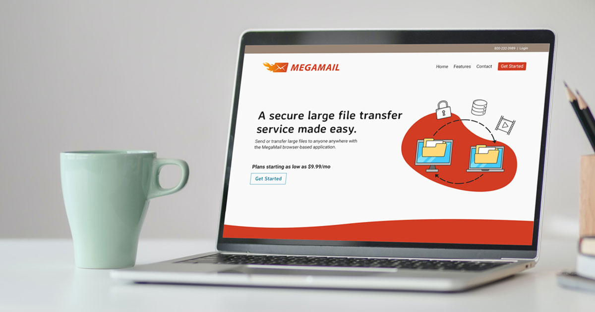
But the work for this project was not all behind a login screen, there were also the public facing portal pages to redesign. I had fun creating various vectors and other imagery for the site. These pages, just like every other aspect of the application, have both English and Japanese options. Japanese is a language that does not always translate directly to and from English, so it can be tricky to make sure everything looks okay displaying both languages.
Emails Clients
Another aspect of MegaMail is the various email templates that were needed to make the app function as intended. I had the pleasure of writing the code for all of the email templates, as well as testing them accross multiple email client. Those include but are not limited to - Gmail, Outlook, Outlook Desktop (*gasp), Aol, Yahoo, and Apple Mail. These were tested across multiple devices, of course.
Email templates were needed not just to receive files, but also for changing passwords, setting up SMTP servers, and welcoming new users as well.
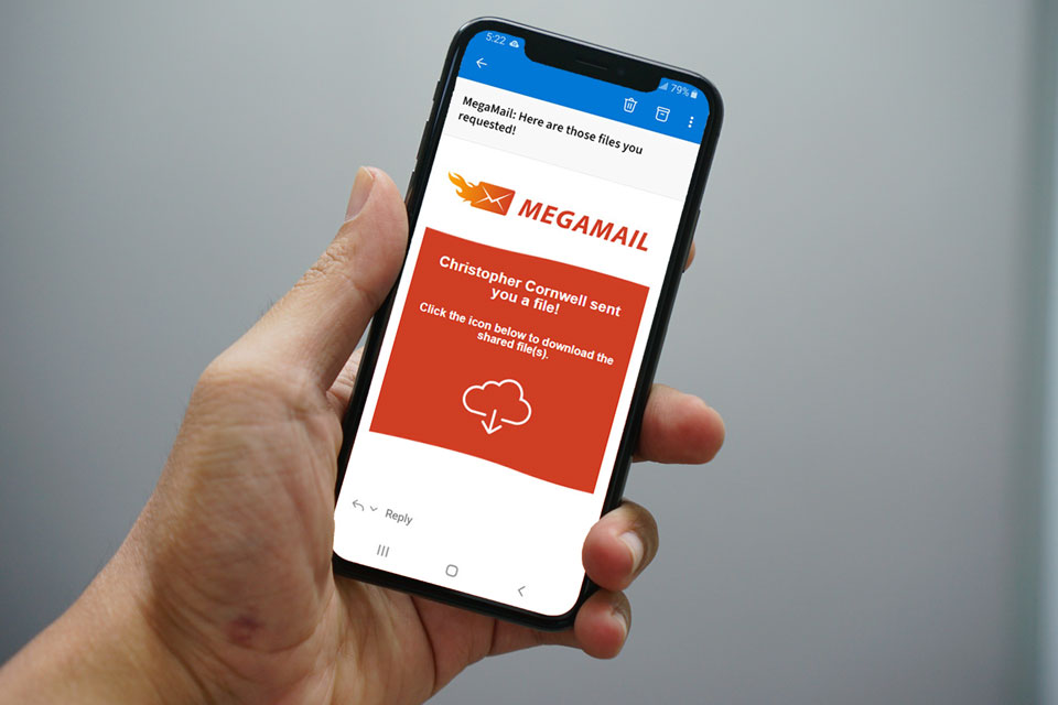 A look at one of the email templates used for MegaMail.
Looking Ahead: A Strong Foundation for the Future
MegaMail's new brand identity and redesigned web application not only modernized it's visual presence but also significantly improved user experience, engagement, and overall functionality. The transformation of Megamail’s brand and web app experience marks a pivotal step in its evolution from a legacy tool to a modern, user-centric platform.
